|
|
Forms |
Allows you to create various pages with forms such as a contact us or a feedback form for your visitors to complete and submit.
Setting Up Your Plug-in
 |
|
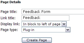
| After clicking your Page Editor icon in your Admin Control Panel, you will need to click the text link for a New Page. In this example, we are going to set up a Feedback Form. In the Page title I have inserted the page name. This title is also what will be displayed in your navigation menus. In the Link title I have entered 'Feedback'. Remember, this is the name file that will be created and must be one word. Next decide where you wish the link to display. And finally, since this is a Plug-in, change the Page type from HTML to Plug-in. Click the Create Page button to continue. | |
|
|
|
|
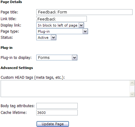
To complete the activation of your new Plug-in,
you will need to change the Status from Hidden to Active.
Next you will need to change the Plug-in to display from the
default to the 'Feedback Form', or whichever Plug-in you
are actually installing.
See left example of changes. Finally select Update Page. After you have completed these steps, you can return to the Control Panel. You will now be able to see and select the Forms icon in your Administrators menu to set up your new Feedback Form.
|
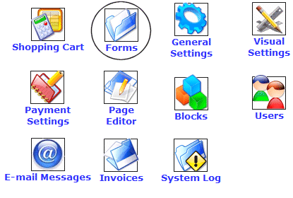 |
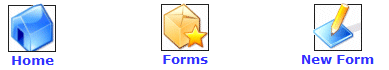
To access your Forms, you will need to click on the icon that is circled in this image (Forms). Once you have clicked the icon, you will see a menu similar to the one below...
|
After clicking on the Forms icon you will see the following:
 |
Here you are able to access and administer forms you have already created and create new ones

First you will need to click on the New Forms icon to create your first form.
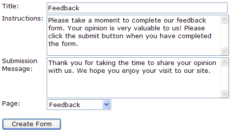 |
The Title should be the name of the Form you
are creating.
You should place a bit of instructions in the Instructions field to further clarify for your visitors what the purpose of the form is and maybe what you will be doing with the results. The Submission Message is the message that will be displayed to the visitor after they have completed and successfully submitted your form. Use the Page dropdown bar to select which page the form should appear on in your website. In the first few steps of this chapter, we created the Feedback Page, and set it up to accept the Forms plug-in. NOTE: You cannot add a form to any other Plug-ins type page or a page that is set as an HTML page. It must have the plug-in Forms associated with it in order for the form to display. |
Click the 'Create Form' button to move on to the next step in setting up a form.
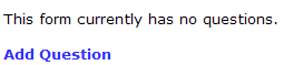 |
You will now see the message "This form currently has no questions". You will need to configure the question fields in order for the visitor to complete your form. Click the 'Add Question' link to continue. |
| You will now be able to insert the first question for the first field you wish to ask. Below is a quick run though off all the field choices and their purposes. |
Almost all of the fields use
share a common set of settings, plus each one generally has a few special
settings which are specific to the field type. The "common"
field settings are:
Field
type: This just defines the input field type, eg: plain text, a
selection list, a checkbox, etc.
Caption:
The plain text caption that appears next to the field.
Field
name: A short name for the field, composed of only the letters a-z
and digits 0-9 -- no spaces or punctuation. (Internally, this is
used as the column name in the database table.)
Field
size: (used by most, but not all field types) Specifies the size
(width) of the field on the screen. This is the equivalent of, for
example, using <input type="text" size="xxxx" />
when creating a field in HTML.
Max
length: (used by most, but not all field types) Specifies the
maximum length of the text entered by the user. This can be longer
than the "Field size", and if so, the field will just scroll
horizontally. This is the equivalent of, for example, using
<input type="text" maxlength="xxxx" /> when
creating a field in HTML.
Required:
If required, the user must enter a value for the field, otherwise an error
will be displayed when the field is submitted.
Default
value: Used to provide a default value for the field. For
example, if you were creating a field called "Country", you may
want it to default to "USA" to save your American users some
typing. So you'd enter "USA" here, and the script will
automatically put "USA" in the field for the user.
Here's
a breakdown of the field types, what they do, and descriptions of their
settings:
Cancel Button
Description
Provides a simple button which, when clicked, redirects the user to a specific
URL. Used to return a user to a particular page when he clicks
"Cancel".
Fields
URL: Specifies the URL to
which the user will be redirected when he clicks the button.
Checkbox
Description
Provides a single checkbox field
Fields
Checked: Determines whether or not the checkbox will appear with a checkmark in it by default.
Checkbox Group
Description
Provides a group of checkbox fields. User can put checkmarks next to as
many items as he likes.
Fields
Options (one per line): Sets
the options that will appear for the user to choose from. eg:
entering:
Apple
Orange
Banana
Would provide 3 checkboxes, eg:
[_] Apple
[_] Orange
[_] Banana
Default item: Enter the name of the default item(s). eg: Entering Apple,Banana would put checkmarks next to Apple and Banana by default.
Date
Description
Provides a date field, allowing the user to select a month, day, and year from
dropdown boxes.
Fields
Default value: The default value for the date field, in YYYY-MM-DD format.
Start year: The first year displayed in the "year" dropdown box.
End year: The last year displayed in the "year" dropdown box.
Time
Description
Provides a time field, allowing the user to select an hour and minute from
dropdown boxes.
Fields
Default value: The default value for the date field, in HH:MM:SS format.
Date and Time
Description
Provides a date/time field, allowing the user to select a month, day, year,
hour, and minute from dropdown boxes.
Fields
Default value: The default value for the date field, in YYYY-MM-DD HH:MM:SS format.
Start year: The first year displayed in the "year" dropdown box.
End year: The last year displayed in the "year" dropdown box.
Display Field
Description
Provides an easy way to display HTML text in a form. This is typically
used to display instructions for filling out the form.
Fields
Text to display: The text to
display on the form. HTML code is allowed.
E-mail Address
Description
Provides a field into which users can enter an E-mail address. This
field is validated by the forms system; input MUST be in the format user@domain.tld
or an error message will be displayed when the user submits the form.
Fields
None (all standard)
Floating Point Number
Description
Provides an input field for a floating-point number. A floating-point
number is any number which includes a decimal point; for example, a dollar
value (199.99) or a temperature (98.6).
Fields
Decimal places: The number
of decimal places to store. For example, if the "decimal
places" was set to 1 and the user entered a number with two decimal
places (such as 92.49) this would be rounded up to 92.5.
Signed: Specifies whether or not signed (negative) numbers should be permitted. If this is not enabled, then all numbers must be positive.
Integer
Description
Provides an input field for an integer, or "whole number". An
integer is any number which does not
include a decimal point; for example, an age (27) or a quantity (4).
Fields
Maximum value: Specifies the
maximum size of the number the user can enter. The options provided
correspond to internal size limits, and there is a performance penalty for
the larger sizes; always try to use the smallest limit possible for your
data. For example, for something like an Age field, a maximum value
of 255 is plenty; setting the maximum value to 4 billion would be wasteful
and unnecessary.
Signed: Specifies whether or
not signed (negative) numbers should be permitted. If this is not
enabled, then all numbers must be positive. Note that allowing
signed integers reduces the maximum avalue by half.
Multi-line Text Field
Description
Provides a multiple-line text field into which users can enter freeform text.
This corresponds directly to an HTML <textarea> tag, and is commonly
used for submitting comments, special instructions, and so-on.
Fields
Rows: Specifies the number of rows (vertically) that will be provided for text input.
Columns: Specifies the number of columns (horizontally) that will be provided for text input.
Password
Description
Provides a masked field into which a user can enter a password. Note
that this is generally reserved for internal use only; saved passwords cannot
be retrieved as they are stored using a one-way hash.
Fields
None (all standard)
Radio Buttons
Description
Provides a group of radio buttons fields. User can select only one
option from the list.
Fields
Options (one per line): Sets
the options that will appear for the user to choose from. eg:
entering:
Apple
Orange
Banana
Would provide 3 radio buttons, eg:
( ) Apple
( ) Orange
( ) Banana
Default item: Enter the name
of the default item(s). eg: Entering Banana would place a bullet
next to "Banana" by default.
Reset Button
Description
Provides a button to reset the form (clearing all form fields).
Fields
None (all standard)
Selection List
Description
Provides a dropdown selection list from which the user can select one (or
more, depending on settings) item(s).
Fields
List size: Sets the vertical
size, in lines, of the selection list. Generally you would set this
to 1 for single-selection lists, or a reasonable number such as 5 for
multiple-selection lists.
Multiple selections:
Specifies whether or not the user is allowed to select multiple items from
the list (by holding Ctrl while clicking on items). If not, the user
can only select a single item from the list.
Options (one per line): Sets
the options that will appear in the dropdown box for the user to choose
from. eg: entering:
Apple
Orange
Banana
Would provide a dropdown box containing those three items.
Default item: Enter the name of the default item(s). eg: Entering Apple,Banana would highlight Apple and Banana by default.
Submit Button
Description
Provides a button on which the user can click to submit the form.
Fields
None (all standard)
Text Field
Description
Provides an input field into which the user can enter a single line of text.
This is the most common type of input field, used for entering names,
addresses, and so-on.
Fields
None (all standard)
Don't forget to add a submit button at the bottom of the form!
Click the 'Create Form' button to move on to the next step in setting up a form.
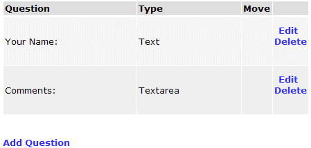 |
Now you will see the current questions available for this
form. I have gone ahead and completed the next question in this
example. I created a place for them to enter their Comments and
made sure to allow them multiple lines of text (Textarea field).
Here I can also Edit or Delete questions, move the question up or down in the list, or add new questions to this form if needed. |
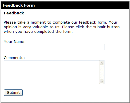
Below is how the new form looks on my new Feedback page for my visitors.
 |
Upon a visitor completing a form, you will be notified of the results via email. This information is also stored online for your review at anytime, and edit or delete any or all aspects of this form. Clicking the Forms icon will allow you to do this. |
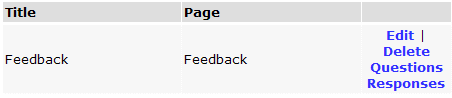
Click the Responses link to see a log of all submissions related to a particular form.
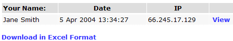
Here you can view the name of the person submitting the form, the date it was submitted, and the IP address of the submitter. Clicking the View link will allow you to view the individual results of this form. Clicking the Download in Excel Format will allow you to download the results in a spread sheet format that you can open in Microsoft Excel.
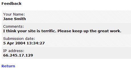
Upon clicking the view link, the results will layout like this:
You can use your Forms Plug-in to create all types of form! feedback, contact us, contest entries, subscribing to your newsletters, or whatever. Have fun!
Close this window to return to the Training Guide.